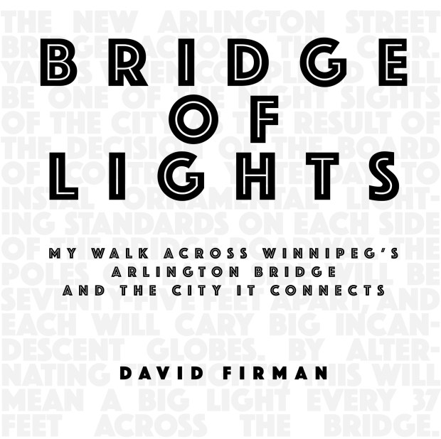
The last two posts to WalkClickMake have focussed on a small project I am working on, a walk down Winnipeg’s Arlington Street in Winnipeg and across the splendid landmark at its midpoint, the Arlington Bridge.
The idea began innocently enough last May, with a casual walk across the bridge and an opportunity to play with the panoramic function of my iPhone to create a few abstracted views of the bridge’s superstructure.
Those experimental images led, later that year, to my Arlington Street project: a walk down the length of the street; a visual diary of still and panoramic photos; an essay; and, finally, a book.
Books give my small walk projects their form. From my perspective, designing a book adds a heightened level of creative pleasure to my work. I enjoy the bookmaking process, assembling a collection of photographs, editing and sequencing them, laying them out on the pages, adding graphics, writing essays. There is a thrill to unwrapping the first printing of a book, seeing my story unfold from cover to title page to frontispiece to story to photos to coda. It is like that first small print I made in a darkroom, watching the image magically appear in the tray of developer.
My books are self-published, print-on-demand (POD) titles. I use Blurb as my POD printer, although there are many other options. POD is critical to my process. I am producing small, personal volumes about subjects that might matter only to me. There is no mass market for a book about a quiet walk, no likelihood of interest by a large publishing house. Nor would I pursue that route. As an indie publisher, I can dream of a book idea, put it together, print it and distribute it as the small scale art work it is intended to be. And I can repeat the process over and over, producing any number of volumes in a relatively short time.
Over the last week, I have been assembling the Bridge of Lights book in Blurb’s BookWright page layout application. The photo pages were first prepared as two-page spreads in Photoshop, an additional step that was necessary to manage a complex layout that included long panoramas spreading across the gutter and rectangular photos scattered around the panoramas. The pages also included line text, street names that would act as vague geographical way-markers as the pages were turned.
I wasn’t comfortable with the look and fussinesss of the text. It occurred to me that the typography should have more of a map-like feel and function. As a part of this week’s refinement, I took my cue from Google and other printed maps, all of which repeat the street name multiple times on a map page, using an easy-to-read sans-serif font like Arial or Helvetica. My take on that convention is to repeat the street names in Helvetica but much more tightly. I want to create a continuous line of text that graphically represents the mapped street as it crosses the page and off its edge.
This use of typography became the tie-in for other graphics in the book. There is a key map, to scale and geographically accurate, but consisting only of text. Similarly, the frontispiece has a backdrop of toned-down text – the Bridge of Lights quote from the 1911 Manitoba Free Press article – repeating the display font, Phosphate, used for the cover and title page.
There seems to be an engaging flow from cover to conclusion. I will find out next week when my first proof of the book arrives from Blurb. Stay tuned…


Leave a Reply